For my project for the Illuminate festival it was necessary to have a closer look at the relationship between the additive and subtractive colours (also called primary and secondary colours) to understand colour contrast in still and moving images.
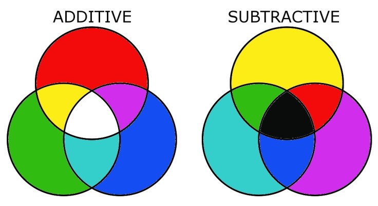
Red, blue and green are the three primary colours. They are the only colours that the cells in our eyes can actually see, all the others (for example yellow) are only interpreted in our brains. Red, green and blue are also called additive colours because white light is made up of these three colours and therefore, they all “add” their share to the total of white light. When we see a white object or white light, it means the presence of those colours (even though we perceive it as colourless). A black object means the absence of all colour.
When white light hits an object, the surface selectively blocks some (or all or none) of the primary colours and reflects others (or all or none): only the reflected ones contribute to the viewer’s perception of the colour of the object. If an object has a surface that we see as red it means that it is built of material that reflects 100% of the red light spectrum and absorbs 100% of the green and blue light spectre. Of course, that would only apply for “pure red”, there are other surfaces that might reflect a bit green or blue as well and still look reddish.
In a photography workshop in my home university we did experiment with red, green and blue foils on a light table: If the red foil was laid over the green foil, the result was black. That’s because the red foil blocks all the green and blue colour while the green foil blocks blue and red. Therefore, all the primary colours are blocked and this absence of colours leads to black.
Krech, L. (2010) N/A. Available at: https://lucaskrech.com/blog/index.php/2010/01/22/color-theory-basics-additive-and-subtractive-color-mixing/ (Accessed: 10 November 2019).
For each of these primary colours exists a so-called complementary colour that contains all the other colours except that additive one. A colour that reflect equal parts of the blue and green light spectrum but blocks the red is cyan, which is therefore the complementary colour to red. Magenta reflects blue and red and is the complementary colour to green and for blue it is yellow, because it contains equal parts of red and green. Graves (1997, p. 106) noted that each of these colours subtract their additive complement from white light and are therefore called subtractive colours: Cyan is the complement (or the absence) of green, yellow is the complement of blue and magenta is the complement of red.
To describe any colour in any specific situation it is necessary to look at the three distinct qualities of every colour: hue, brightness and saturation.
Hue means the name on the colour, for example green or blue, and refers to a specific wavelength of the colour spectrum (Graves 1997, p. 103). The brightness of a colour refers to its lightness or darkness in comparison to other surrounding colours. Graves (1997, p. 103) explained that the saturation indicates the strength or intensity of a hue or in other words the pureness of a colour. If a hue (for example red) is mixed with a lot of white it becomes a pastel colour (for example dusky pink) which is a “less saturated red” than the pure hue without the white.
Visually describing a colour based on each of these terms can be highly subjective but is still a good way to compare different shades of colour. For example, black is a hue with low brightness (it’s as dark as possible) and no saturation. It is important to bear in mind that the colour and the way we can see it depends on the lightning situation: A blue ball looks different in the bright sunlight than in a dark wardrobe. Colour is in the light.
All visible colour can be produced with a certain combination of the primary colours, using either subtractive or additive processes: “Additive processes create colour by adding light to a dark background, whereas subtractive processes use pigments or dyes to selectively block white light.” (Cambridge in Colour, 2016)
Devices that use primary colours can produce the maximum range of colours: “Monitors release light to produce additive colors, whereas printers use pigments or dyes to absorb light and create subtractive colors.” (Cambridge in Colour, 2016) That is the reason most monitors use a combination of RGB pixels (red, green and blue) whole most colour printers have CMYK ink (cyan, magenta, yellow and black). The black ink is necessary to produce deep enough shadows which might not be possible with only CMY.
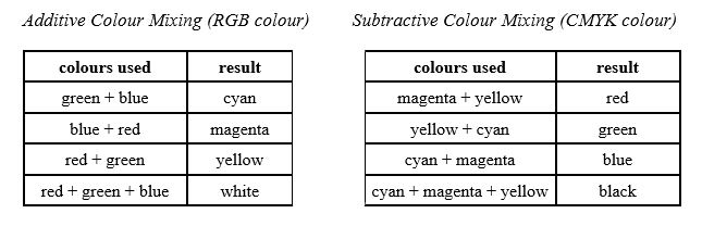
In the tables below I did an overview about how those devices use colour mixing to produce any other colour with only RGB or CMYK:
These mixing of colour is necessary for monitors or TV screens to show colour images: Pritchard noted that each pixel on the surface of the monitor screen has three colour transmitters, each of them activating a separate pattern of dots on the screen (Pritchard, 1995, p. 43). A screen would appear as a mosaic of red, green and blue dots when enlarged through a magnifier. The human eye is not able to see those different dots but only the colour that appears through the mixing.
Cambridge in Colour (2016). Tutorials: Colour Perception. Available at: http://www.cambridgeincolour.com/tutorials/color-perception.htm (Accessed: 09 November 2019)
Graves, C. (1997). The Zone System for 35mm Photographers. A Basic Guide to Exposure Control. Burlington: Focal Press.
Pritchard, D.C. (1995). Lighting. Essex: Addison Wesley Longman Limited.
header photo: Darius, A. (2017) N/A. Available at: https://unsplash.com/photos/jvR9ieZVG64 (Accessed: 10 December 2019).
